
Match between the system and the real world
A bank or government form can contain a word that a designer is not allowed to rename. The term may be fixed by a regulation, a contract, or the process behind the service. That does not release the interface from the duty to be clear. Match between the system and the real world means preserving the official term while building a plain-language bridge to the person using it.
What does match between the system and the real world mean when the term cannot change?
The usual advice is sensible: use the words people use, not the words an internal database uses. Jakob Nielsen's heuristic says, "The design should speak the users' language. Use words, phrases, and concepts familiar to the user, rather than internal jargon." That is a useful starting point, but it can become careless advice in regulated services.
In a bank, a ministry, or a healthcare service, a label may have a legal meaning. Replacing it with a friendlier synonym can change what a person thinks they are agreeing to. The designer's job is therefore not to choose between official language and plain language. It is to show their relationship.
The official term can remain visible. Beside it, the interface can explain what it means here, why it is needed, and what the person should do. This is a bridge.
Why is a vocabulary gap a user problem?
People do not enter an enterprise service with the system's mental model. They arrive with a goal: send money, prove identity, renew a permit, or submit a claim. The system divides that goal into categories and ownership boundaries that may be necessary for the organisation, but are rarely the person's starting point.
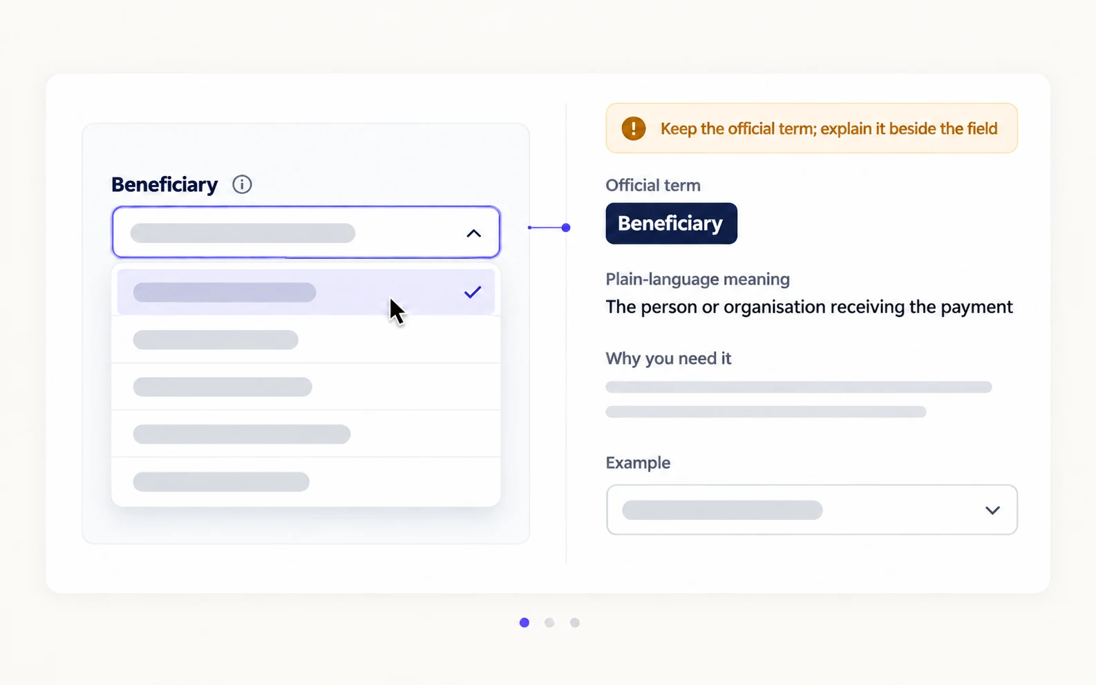
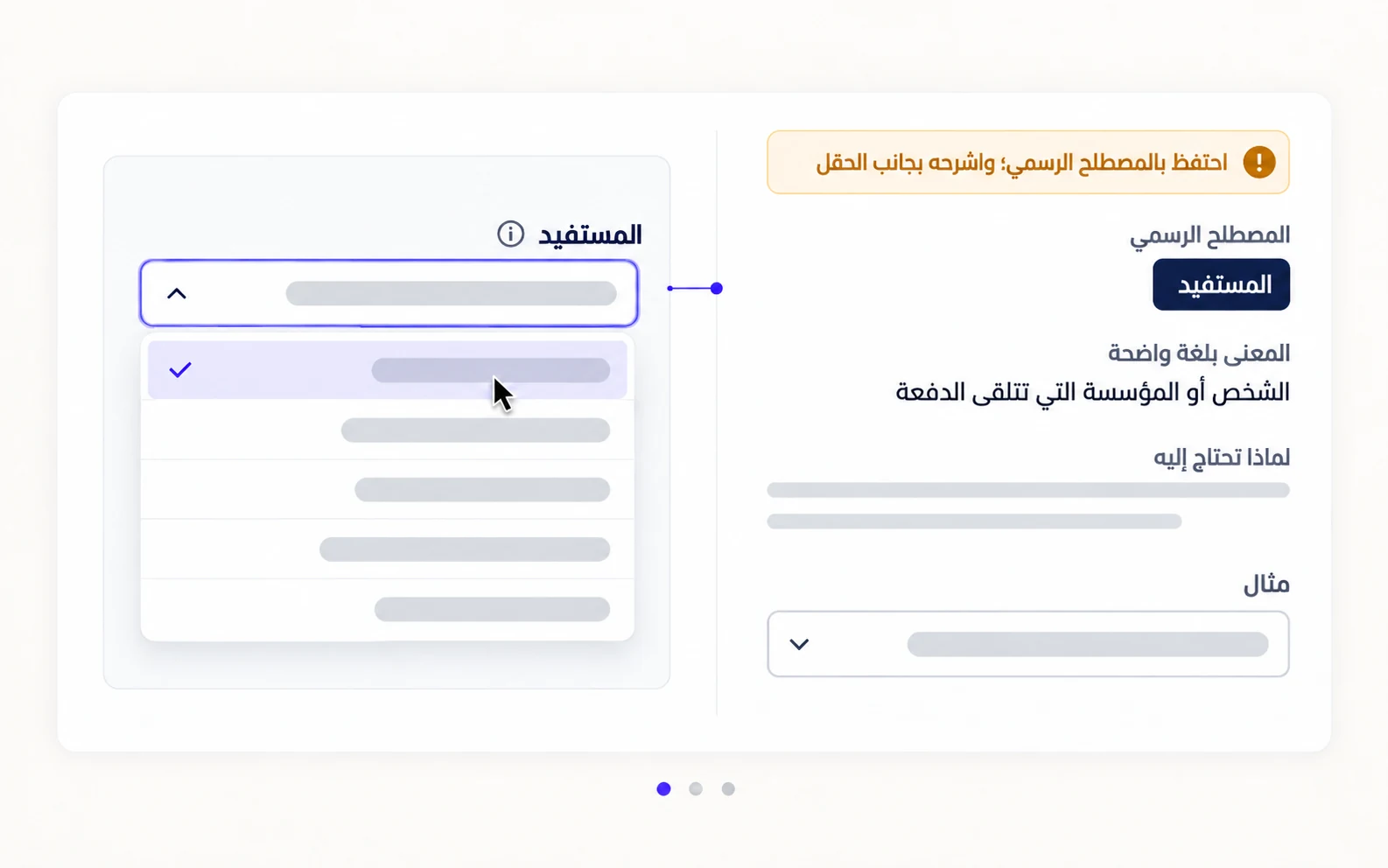
How does a bridge layer work in practice?
Start with the official term, then attach the meaning at the moment the person needs it. A field might read "Beneficiary", followed by "The person or organisation receiving this payment". A government service might retain the formal name of an application, then add one sentence about what the application lets the person do.
The supporting sentence must answer a real question: what is this, why are you asking, or what changes if I choose it? A tooltip that hides the answer behind an icon is a weak bridge.
Glossaries help, but they do not replace context. Put the explanation near the field, preserve the same term wherever it appears, and record the term, meaning, owner, language, and review date.
What changes when the interface is bilingual?
Translation is not a word swap. Arabic and English can carry different levels of formality, legal weight, and everyday familiarity. A normal term in one language may sound bureaucratic, vague, or too broad in the other.
Test the bridge in both directions. Ask what the label means, then what action it suggests. If groups infer different consequences, choosing the more elegant translation has not solved the problem.
Keep the official term where accuracy demands it. Add a short explanation in the user's language and test the pair in the screen, not only in a translation spreadsheet. The surrounding verb and example can change its meaning.
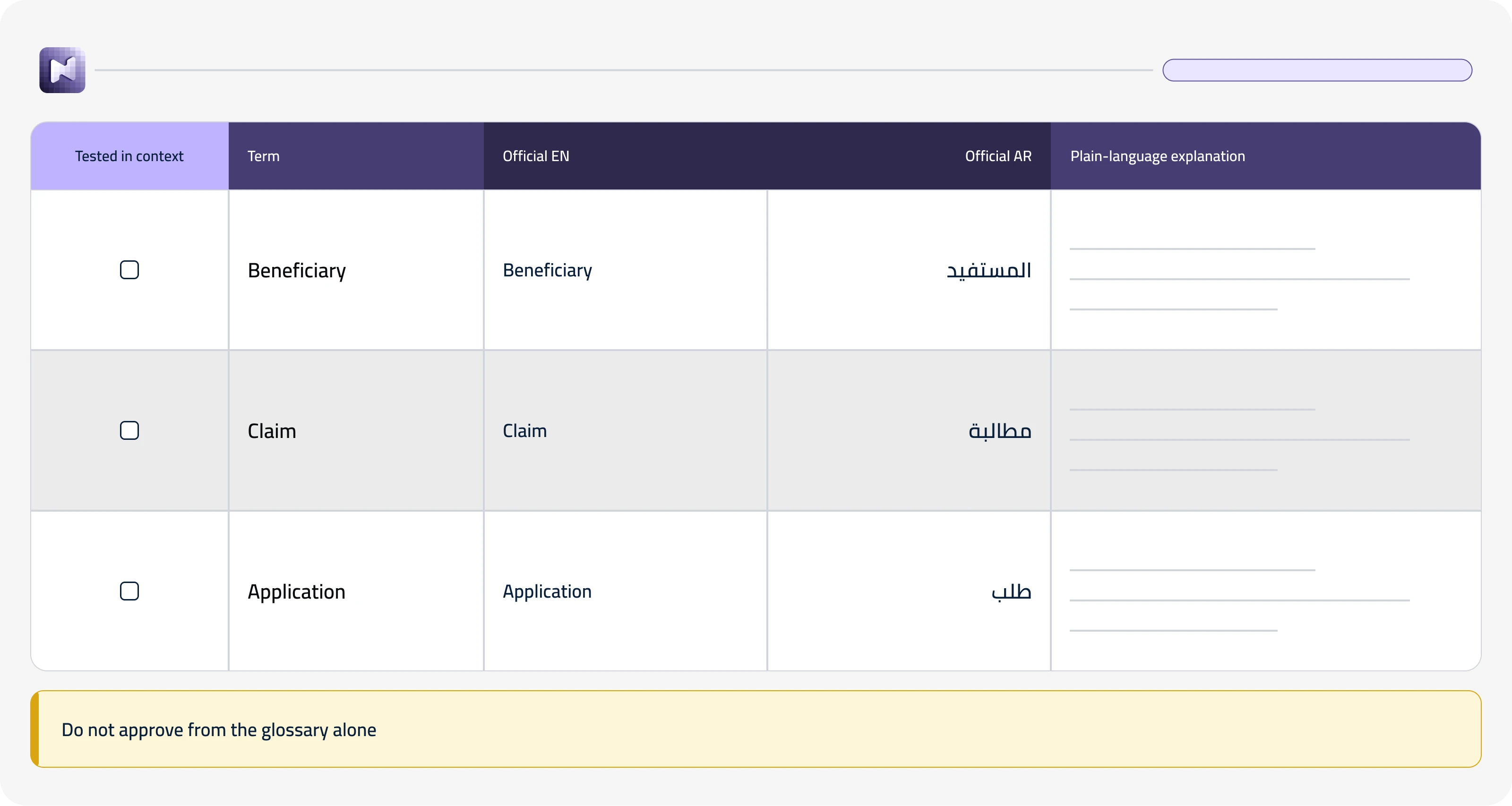
What belongs in the glossary, and what belongs on the screen?
The screen carries the smallest explanation that prevents a wrong decision. The glossary carries the agreement behind that explanation: the approved term, its meaning, related terms, forbidden substitutes, translation notes, and the team responsible for change.
If the interface still exposes an unexplained acronym, the organisation has documented the problem without removing it. Review the glossary against real screens and real questions. If people keep asking, the bridge is missing.
In regulated services, clarity is a bridge layer: keep the official term, add its plain meaning beside the decision, and test the pair in every language.