
Designing UI with AI tools
A ten-screen flow can begin with one impressive frame: a clean dashboard, a persuasive hierarchy, and enough polish to make the blank page disappear. The first screen is where AI looks most convincing. The second screen is where the work starts. The reason is simple. AI can generate a plausible screen from a brief, but it does not carry the design decision from screen one into screen two unless you make that decision available again. Designing UI with AI tools is therefore a consistency problem across a set, not a contest to produce one attractive image.

Why does the first AI-generated screen look so good?
The opening screen usually has the clearest brief. It has a familiar job: welcome the person, show the main value, or give a quick view of important information. AI has seen many versions of those patterns.
That is useful. A designer can get past the empty canvas and compare directions. Figma describes this use as exploring with the right context, goal, and constraint, rather than asking for a finished answer.
The trap is treating the first frame as proof that the system is understood. A visually convincing frame may contain decisions that were never named: a spacing rhythm, a hierarchy between primary and secondary actions, a rule for card density, or a choice about what disappears on a smaller viewport.
That silence becomes expensive on the next screen.
What falls apart when the second screen arrives?
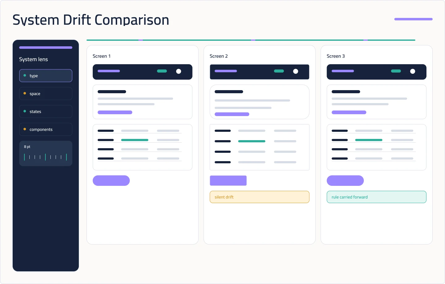
Screen two inherits the product task, but it does not automatically inherit the reasoning. If the first frame used a compact card because the user needed to compare records, the next generation may use a larger card because that pattern is common in its learned examples. Both can look polished. They answer different questions.
This is silent drift: a change that appears reasonable in isolation but breaks the relationship between screens. A radius changes. The space between a label and field follows a different scale. A table becomes a set of cards. The empty state vanishes because the prompt described the successful state. Nothing looks broken until the screens sit beside each other.
My UI Design Book treats grids and spacing as a structure that should stay consistent across pages and devices. An 8-point or 10-point rhythm helps only when the workflow can inspect it as a rule.
A strong first screen proves that the tool can produce a screen. The second screen tests whether the workflow has a system.
Where should AI sit in a real UI workflow?
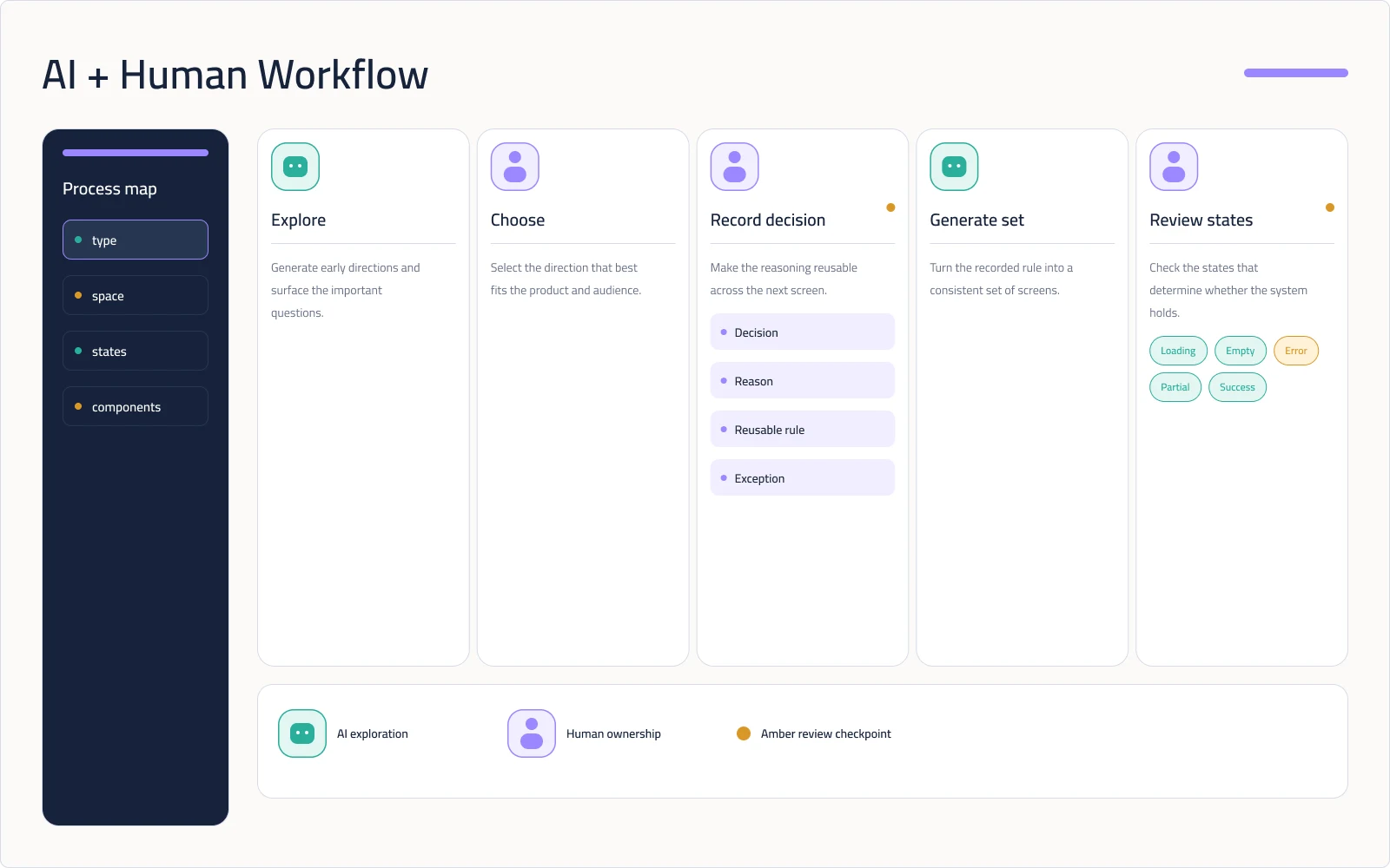
Put AI near the start of exploration and near the repetitive middle of production. Ask it for distinct layout directions, a first pass on a component composition, or variations that help the team see a choice. Give it a selected frame, a published library, or a precise reference when the work must stay within an existing product language.
Keep the decision points human. A designer decides what the user must notice first, which state is safe to omit, what the system can actually support, and which visual difference carries meaning. AI can suggest a pattern. It cannot take responsibility for the product consequence of that pattern.
The handoff between those roles needs a small record. For every important screen, write down the decision, the reason, the reusable rule, and the exception. Use a dense table is incomplete. Use a dense table when people compare many records; use a card when each record is an entry point gives the next screen a choice to follow.
The record also names loading, empty, error, permission, partial-data, and success states. A demo usually shows success. A product has to explain what happens when data is missing or an action cannot continue.
How can a designer keep ten AI-generated screens consistent?
Start with a reference screen that has survived design review. Extract its type scale, spacing scale, grid, action hierarchy, component names, states, and responsive behaviour. Mark open decisions instead of allowing the tool to settle them silently.
Work in batches with a comparison pass after each one. Place the screens side by side. Check repeated components, relationships, and any value or pattern that has no recorded reason.
When a mismatch appears, fix the rule and regenerate the affected set. Editing one screen by hand may make the board look tidy for an hour while leaving the source of the drift intact. The short-term patch is often the long-term inconsistency.
This is where a constraint-first design brief helps. It turns taste into language the next generation can use. The fuller version is a design system for an AI agent, where the rules include component choice and forbidden patterns, not only colours and spacing.
AI is good at opening the door. The designer still decides which rooms belong in the building.